|
Good and bad business communication examples can serve as effective teaching aids. The hard part is finding the examples. Search no more. In my teaching, I love to teach a principle and then show illustrating examples in authentic documents. The problem is that authentic examples are hard to come by. To help remedy this issue, I created the list below to serve as a link repository where business communication and technical communication instructors can find examples. To keep things simple, I’m keeping the detail in the list short and to the point. If you need to find a specific genre, audience, format, or industry, consider using CTRL-F (or CMD-F) and to search this page for the keyword you’re interested in. Remember that what constitutes effective or ineffective communication hinges upon many factors, including the criteria set forth in the textbook you’re using. Therefore, I recommend determining your criteria for what good and bad examples will look like before you begin searching for examples. This practice should save you some time and ensure that the examples you find reflect the principles you’re illustrating to your students. I’ll continue to update the table with other examples that I find. I welcome your comments below with any other examples to add to the collection. I hope you’ll find it useful. Also, if you or your students need a great resource for document conventions, take a look at the free business document formatting guide available on our site. --Matt Baker AnnualReports.com From the site: “Search 111,928 annual reports from 9,179 global companies.” Tips: The search bar is right on the home page. You can search by company name or ticker symbol. Bplans.com From the site: “Browse our library of over 500 business plan examples to kickstart your own plan.” Tips: These plans are not authentic business plans, but they provide numerous examples across many industries, so I think they’re worth including here. To find the plans, click on the “Sample Plans” link located at the top of the page and then browse for a plan of interest by industry. Grants.gov From the site: The site’s mission is to “provide a common website for federal agencies to post discretionary funding opportunities and for grantees to find and apply to them.” In essence, the site houses grant opportunities from the U.S. government. Tips: Use the search field in the top right-hand corner of the site to search for grants including the keyword of your choice. On the results page, select the link in the “Opportunity Number” column for your grant of choice. You’ll see a synopsis of the grant, but you can click on the “Related Documents” tabs to find links to the entire grant. Library of Congress From the site: “The Library of Congress is the largest library in the world, with millions of books, recordings, photographs, newspapers, maps and manuscripts in its collections. The Library is the main research arm of the U.S. Congress and the home of the U.S. Copyright Office.” Tips: You’ll see a search bar at the top of the page. If you’re looking for a specific document type, such as memos, letters, or emails, type it in the field. On the results page, you can then filter based on the type of data you’d like to see, such as PDFs. You can find some interesting things here, such as the Enron email dataset or historical NEH grants. (I tried downloading the Enron email dataset, and please be aware that it’s an enormous file.) NASA Technical Reports Server From the site: “Conference papers, journal articles, meeting papers, patents, research reports, images, movies, and technical videos – scientific and technical information (STI) created or funded by NASA.” Tips: Use the search bar at the top to find resources. The search results page includes additional search filters. Once you find a document you want to download, click the download icon in the bottom right-hand corner of the search result. Also know that because this is government-generated content, it’s in the public domain. Sam.gov From the site: “Anyone interested in doing business with the government can use this system to search opportunities.” In essence, whereas Grants.gov focuses on listing grant opportunities, Sam.gov lists requests for proposals (RFPs) for companies seeking to complete contract work for the U.S. government. Tips: Click on the “Search” tab located in the middle of the screen. In the search field, click on a keyword of interest. In the results, click on the title of a contract opportunity that interests you. The detail of the opportunity with then be displayed in your web browser, but please note that statements of work (SOW), requests for quotes (RFQ), and other documents can be downloaded in PDF format at the bottom of the web page. Ted.com From the site: “TED is a nonprofit devoted to spreading ideas, usually in the form of short, powerful talks (18 minutes or less).” Tips: Click on the “Watch” menu to search for talks. Advanced search options are available. TheWhitePaperGuy.com From the site: “I'm a seasoned white paper writer who’s done hundreds of B2B content projects.” Tips: Click on the menu and find the “Samples” area. You’ll find numerous examples of white papers in PDF format. UCSF Industry Documents Library From the site: “The Industry Documents Library is a digital archive of documents created by industries which influence public health, hosted by the University of California, San Francisco Library. Originally established in 2002 to house the millions of documents publicly disclosed in litigation against the tobacco industry in the 1990s, the Library has expanded to include documents from the drug, chemical, food, and fossil fuel industries to preserve open access to this information and to support research on the commercial determinants of public health.” Tips: The search bar at the top includes an advanced search option. U.S. Bureau of Labor Statistics From the site: “The Bureau of Labor Statistics measures labor market activity, working conditions, price changes, and productivity in the U.S. economy to support public and private decision making. . . . The first BLS Commissioner, Carroll D. Wright, described the Bureau’s mandate as ‘the fearless publication of the facts.’” Tips: To begin your search, click on the Publications link at the top of the page. In In my teaching, Know that part of the site is dedicated specifically to teachers as well. In my teaching, I’ve used this site primarily for data displays.Because this is government-generated content, it’s in the public domain. U.S. Government Accountability Office From the site: “GAO provides Congress, the heads of executive agencies, and the public with timely, fact-based, non-partisan information that can be used to improve government and save taxpayers billions of dollars.” Tips: To get started in your search, click on View Topics at the top of the site. Also know that because this is government-generated content, it’s in the public domain. In my teaching, I’ve used this site mostly for example reports, but it also includes other genres such as blog posts and videos.
0 Comments
Recently I went to dinner with a former student who graduated 12 years ago. This student is now a successful attorney who writes numerous legal briefs and other documents that are read by judges and others in the legal profession. During the evening he described how he still uses writing and design principles I developed for my business communication classes: “I use OABC and HATS all the time in my writing, and they give me such a great advantage in writing for judges.” He also said, “I learned more in your writing class than in all the writing classes in law school.”
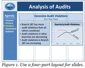
Obviously, I was happy to receive the compliment for my course, but his comments caused me to think about learning retention—what is it that enables students to remember and use writing principles learned in business communication courses? Brown, Roediger, and McDaniel (2014) have written a landmark book on this topic: Make it Stick—The Science of Successful Learning. Roediger and McDaniel are cognitive scientists whose careers have focused on learning and memory, and Make it Stick captures the results of years of their own learning. In this intriguing work, the authors conclude that people generally go about learning in the wrong way. For example, the idea that people learn better when they receive instruction in a manner consistent with their preferred learning style (e.g., auditory or visual) is not supported by research. Further, the idea is false that if we can make learning easier and faster, the learning will be better. In fact, learning that requires more mental work lasts longer. In addition to identifying what doesn’t work in learning, the authors also identify what does work. Three of their proven strategies likely helped my former student retain and use his classroom learning years after graduation. Mnemonics. First, use mnemonic devices. Mnemonics link a memorable name to a larger mass of information. In this case, OABC stands for opening, agenda, body, and closing. This acronym provides a proven pattern that can be used for many business writing situations. HATS refers to headings, art/graphics, typography, and spacing. After a basic message is crafted, students can add headings, appropriate graphics, typographic enhancements, and white space to make the message more visually appealing to the reader. The OABC and HATS acronyms provide easy ways for students to create clear, organized, and visually powerful messages. Integration. Second, integrate all the knowledge learned. All new learning has to connect with previously known information. OABC and HATS are taught early in the semester, and then they are integrated into subsequent assignments throughout the rest of semester. Thus, by the end of the semester, students have had experience applying OABC and HATS in a variety of contexts. Repetition. Third, all new learning requires a rewiring of the brain. Therefore, provide repeated application of new learning to create and reinforce the new wiring. Don’t assume that students have learned new material just because you have covered it once. Rather, continue to re-emphasize important material throughout the course. OABC and HATS are taught fairly early in the course, and students are required to apply the principles contained in these acronyms in all subsequent assignments. This repetition reinforces the learning, which improves the likelihood that students will continue to apply the learning later in their careers. The result is that my student now has these principles so deeply ingrained in his mind that they spontaneously come into his mind whenever he faces a writing project. Further, he not only knows how to use these principles but has a strong conviction of their value in his work. Today’s professional organizations spend millions of dollars each year on training, yet much of this training has little impact on participants’ subsequent business practices. In most cases, it is because real learning never takes place. Consider your own situation. Is there an opportunity for you to implement mnemonics, integration, repetition, and other Make It Stick learning tactics in your organization? If you are a trainer or teacher, I strongly recommend the reading of Make it Stick. Further, I suggest that you visit with a few of your former students (or current students at the end of a semester) and ask them to recall what they remember most from your instruction. If you’re not satisfied with their answers, take time to clearly identify what you want students to learn, and then reinforce that learning with principles of mnemonics, integration, and repetition. I welcome your comments. -Bill Baker Do you feel that your slide presentations look disorganized and unprofessional? Maybe your basic slide layout needs a facelift! Layout refers to the way you arrange your text and graphic elements on the slide. Obviously, you want your slides to look clean and well organized, not chaotic and cluttered. PowerPoint, Keynote, and other slideshow software provide various templates, but they often result in boring slides with too many bullet lists. Instead of using these templates, create your own layout. Here are four suggestions to help. 1. Use a Grid Divide your slide into a four-part grid, as shown in Figure 1:
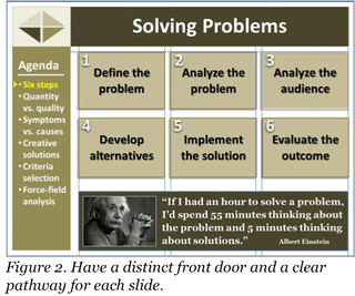
Organize the body area into a grid, consisting of one or more vertical columns, with appropriate space above, below, and between columns. Figure 1 shows an example of a four-column grid for the body. With this layout, you can have one very wide column, two equal wider columns, four equal narrow columns, or an unequal three-and-one column arrangement. In Figure 1, the first body text spans all four columns; the remaining bullet list and graphic span two columns each. Regardless of the layout, always appropriately align the text and graphic items. Items can be top, bottom, left, right, or center aligned, as appropriate. For example, the side-by-side boxes in Figure 1 are aligned both top and bottom. They are also right and left aligned with the heading “Excessive Audit Violations.” The important point is to develop a grid that works for you and to use it to achieve visual consistency among all of your slides. A grid gives your slide presentation a well-organized, professional appearance. (To make sure the gridlines don’t show on your final slides, use the gridlines feature of your software, rather than drawing your own.) 2. Use a Running Agenda Display a running agenda (outline) of your presentation content (in Figure 1, see the agenda in the dark blue bar on the left side of the slide). A running agenda produces two benefits. First, it shows your overall information architecture, which your audience can use for mentally organizing what you present to them. Second, a running agenda helps the audience remember the big picture, even when you take a deep dive into the details of your presentation. Without a running agenda, listeners can easily get mentally lost, not knowing how the details tie in with the overall information. The running agenda can be on the left side of your slides, as shown in Figure 1, or across the bottom. Always include a pointer or other visual indicator to show where you are in the presentation. For instance, while talking about “Analysis” information in your presentation, change the color of “Analysis” in the agenda, and/or place a small arrow beside it (see Figure 1). When you move from the “Analysis” section to the “Conclusion” section, change the color of “Analysis” back to the normal color and highlight “Conclusion.” Also move the arrow to the appropriate point beside “Conclusion.” A running agenda is especially useful for informative presentations, such as training or briefing presentations. Be sure to repeat the agenda on every slide, or at least on the first slide of each major segment of your presentation, to remind the audience of the big picture. 3. Have a Distinct Front Door Make sure each slide has an obvious front door—a clear point of entry. The front door should be a visually dominant object or text item that you want your audience to notice first. Because people’s eyes naturally go to the top of a slide, generally place your front-door item in that area. For many slides, your front-door item will be the slide’s title, displayed in a large font to make it stand out. For example, you could make a slide title highly visible by using a 44-point, bolded Arial font, while using a smaller, less visually emphasized font for the rest of the text on the slide. The large title would attract the audience’s attention and serve as the entry point (front door) of the slide. For other slides, the front door could be a large photograph or another eye-catching visual. 4. Have a Clear Pathway After entering the front door of a slide, your audience should be able to see an obvious pathway through the body of the slide, generally following a natural reading trail from top to bottom and left to right (except for languages written from right to left). For example, with a two-column layout, this path might run from top to bottom in the left column and then top to bottom in the right column. Regardless of a slide’s specific pattern, the path should be visually obvious. As needed, include numbers, arrows, or other visual markers to make pathway clear. For instance, if six text boxes are arranged in a two-by-three pattern, use arrows or numbers (1, 2, 3, 4, 5, 6) to designate whether to read the boxes in top-to-bottom-left-to-right or left-to-right-top-to-bottom sequence (see Figure 2). As you work with slide layout, feel free to alter the layout as appropriate. For instance, use three columns in your body area grid (see Figure 2), rather than using four as shown in Figure 1. To help decide how to lay out your slide content, ask yourself, “Given the information I want to display, what is the best way to organize it on a slide?” You might also ask your colleagues for their input. Two heads are often better than one.
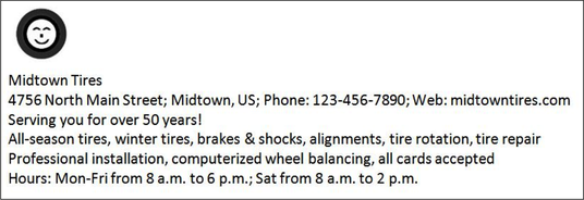
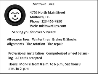
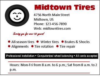
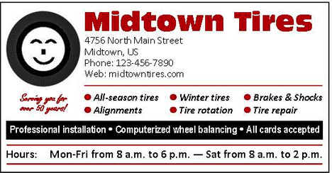
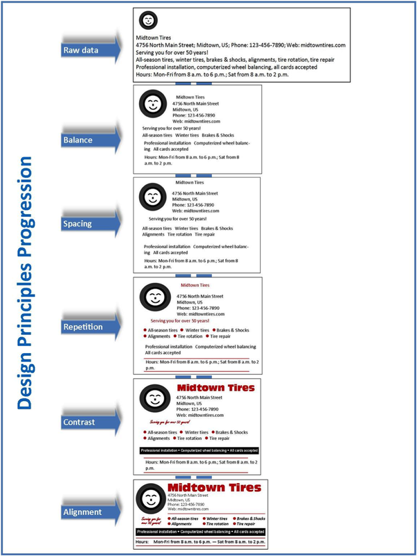
As you create your next slide presentation, apply the four steps presented above. Initially, your layout might take a bit of time to set up. But as you persist, your slides will become more organized, both logically and visually, thus enhancing both the logos and ethos of your presentation. Give it a try and let us know how it works for you. -Bill Baker Today’s world is much more visually oriented than it was in previous generations. Granted, we still consume a lot of text, but more and more messages include a mixture of visuals and text, such as ads, blogs, procedures, business cards, websites, or slides. What guidelines should you follow to ensure good layout and design in messages like these? To answer this question, let’s assume that we want to create an ad that contains the following graphic and text: Five time-tested principles will help you in this process—contrast, alignment, repetition, balance, and spacing. You can remember these principles with the acronym CARBS, but I’ll apply them in the following sequence: balance, spacing, repetition, contrast, and alignment. Balance Text and visuals on a page should be visually balanced, whether symmetrically or asymmetrically. Symmetrical balance produces a page that looks evenly balanced, with the left and right sides being mirror images of each other. With asymmetrical balance, the left and right sides are not visually the same. Nevertheless, in some cases there may still be balance, such as two small items on the right to counter-balance one large item on the left. To the human eye, symmetrical layout looks more formal, but less interesting; asymmetrical layout looks less formal, but more visually interesting. Because we hope to achieve a visually interesting and less-formal ad for our tire store, we might arrange the elements in an unbalanced, or asymmetrical, layout, as follows. Spacing To address the spacing principle, first break your graphics and text into chunks. Then, decrease the space between items within chunks (such as spacing within a paragraph), and increase space between chunks (such as between a photograph and a neighboring paragraph). The white space around each chunk serves as a frame or border, dividing one chunk from another. In some cases, you might want to create an actual border around a chunk. For our tire-store ad, we have seven chunks, so we’ll add extra space around each of these chunks. Repetition To achieve good design, establish a visual theme. A theme is established mainly by repeating one or more elements or attributes. For example, for our tire-store ad, we will use the color red as a repeating element of the ad. In addition, we will use the Calibri font for most of the text in the ad. If the ad were larger, we could also use a large image of a tire as the front door of the ad and then repeat smaller images of the tire as bullets for a list of text items. Contrast Contrast is the key to attracting attention. Contrast can be achieved in countless ways, such as using a different size or color. To use contrast effectively, decide what textual or graphic elements you want to draw attention to. Then make them different from everything around them. For instance, use a different font, or make the font larger, bolder, or more colorful; or use reverse text (white text on black background). You could also include an eye-catching graphic image that stands out from its neighboring text. In our ad, we will use different fonts for the company name and for the company slogan, “Serving you for over 50 years.” We will also use reverse type for one line of text near the bottom of the ad. Further, we’ll use a smiling-tire visual to provide contrast to the text. Alignment Good alignment requires that every item on a page or slide be lined up with something. Nothing should be just floating in space without a visual anchor. For instance, most text should generally be left aligned—that is, aligned on the left margin, with the right end of the text lines not aligned (called ragged right). For a more formal look, you can use both left and right alignment (fully justified text), but remember that left-aligned paragraphs, with ragged right endings, are generally easier to read than fully justified paragraphs. Graphic elements should also be aligned with other text or graphic elements on the page or screen. For example, align the left edge of a picture with the left edge of text that precedes or follows the picture, or align the middle of a picture with the middle of a column of text that follows it. An alternate form of alignment is curvilinear. For instance, if you are writing a blog about playing the guitar, you could place a picture of a guitar on the left margin and then align the left edge of neighboring text to follow the curved body of the guitar. Left and centered alignments are used in the following tire ad. Notice how good alignment improves the visual impression of the ad. As you apply the various CARBS design principles, keep in mind the overall principle of simplicity. Remember, you are designing, not decorating. Know when enough is enough. Further, make sure all the design treatments harmonize well with each other and help achieve the purpose of the message. Finally, remember that the CARBS principles are just that—principles, not rules. Therefore, if you want to violate a principle to achieve a strategic purpose, go ahead. For example, you might choose to violate the alignment principle to achieve greater contrast. However, be sure you have a good reason for doing so—be sure the violation works and doesn’t look like a mistake. Try applying these CARBS principles in your own documents. You’ll find that they will work for you, just as they have done for thousands of others. |
AuthorsWe're Bill, Matt, and Vince, and we hope these posts will help you more effectively teach business and professional communication. If you like what you read, please consider teaching from our business and professional communication textbook. Archives
January 2022
Categories
All
|



 RSS Feed