|
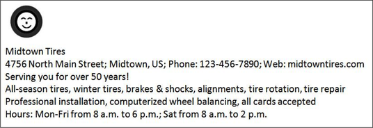
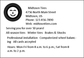
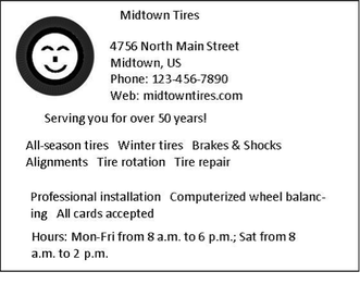
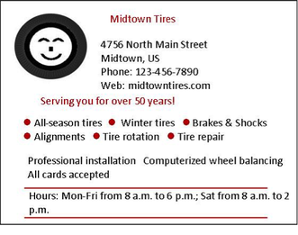
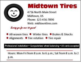
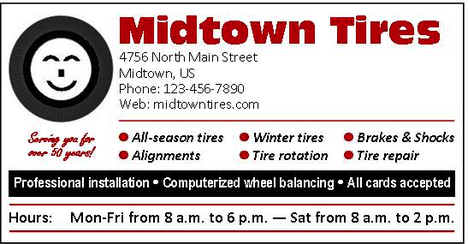
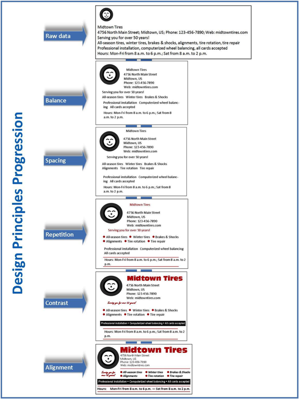
Today’s world is much more visually oriented than it was in previous generations. Granted, we still consume a lot of text, but more and more messages include a mixture of visuals and text, such as ads, blogs, procedures, business cards, websites, or slides. What guidelines should you follow to ensure good layout and design in messages like these? To answer this question, let’s assume that we want to create an ad that contains the following graphic and text: Five time-tested principles will help you in this process—contrast, alignment, repetition, balance, and spacing. You can remember these principles with the acronym CARBS, but I’ll apply them in the following sequence: balance, spacing, repetition, contrast, and alignment. Balance Text and visuals on a page should be visually balanced, whether symmetrically or asymmetrically. Symmetrical balance produces a page that looks evenly balanced, with the left and right sides being mirror images of each other. With asymmetrical balance, the left and right sides are not visually the same. Nevertheless, in some cases there may still be balance, such as two small items on the right to counter-balance one large item on the left. To the human eye, symmetrical layout looks more formal, but less interesting; asymmetrical layout looks less formal, but more visually interesting. Because we hope to achieve a visually interesting and less-formal ad for our tire store, we might arrange the elements in an unbalanced, or asymmetrical, layout, as follows. Spacing To address the spacing principle, first break your graphics and text into chunks. Then, decrease the space between items within chunks (such as spacing within a paragraph), and increase space between chunks (such as between a photograph and a neighboring paragraph). The white space around each chunk serves as a frame or border, dividing one chunk from another. In some cases, you might want to create an actual border around a chunk. For our tire-store ad, we have seven chunks, so we’ll add extra space around each of these chunks. Repetition To achieve good design, establish a visual theme. A theme is established mainly by repeating one or more elements or attributes. For example, for our tire-store ad, we will use the color red as a repeating element of the ad. In addition, we will use the Calibri font for most of the text in the ad. If the ad were larger, we could also use a large image of a tire as the front door of the ad and then repeat smaller images of the tire as bullets for a list of text items. Contrast Contrast is the key to attracting attention. Contrast can be achieved in countless ways, such as using a different size or color. To use contrast effectively, decide what textual or graphic elements you want to draw attention to. Then make them different from everything around them. For instance, use a different font, or make the font larger, bolder, or more colorful; or use reverse text (white text on black background). You could also include an eye-catching graphic image that stands out from its neighboring text. In our ad, we will use different fonts for the company name and for the company slogan, “Serving you for over 50 years.” We will also use reverse type for one line of text near the bottom of the ad. Further, we’ll use a smiling-tire visual to provide contrast to the text. Alignment Good alignment requires that every item on a page or slide be lined up with something. Nothing should be just floating in space without a visual anchor. For instance, most text should generally be left aligned—that is, aligned on the left margin, with the right end of the text lines not aligned (called ragged right). For a more formal look, you can use both left and right alignment (fully justified text), but remember that left-aligned paragraphs, with ragged right endings, are generally easier to read than fully justified paragraphs. Graphic elements should also be aligned with other text or graphic elements on the page or screen. For example, align the left edge of a picture with the left edge of text that precedes or follows the picture, or align the middle of a picture with the middle of a column of text that follows it. An alternate form of alignment is curvilinear. For instance, if you are writing a blog about playing the guitar, you could place a picture of a guitar on the left margin and then align the left edge of neighboring text to follow the curved body of the guitar. Left and centered alignments are used in the following tire ad. Notice how good alignment improves the visual impression of the ad. As you apply the various CARBS design principles, keep in mind the overall principle of simplicity. Remember, you are designing, not decorating. Know when enough is enough. Further, make sure all the design treatments harmonize well with each other and help achieve the purpose of the message. Finally, remember that the CARBS principles are just that—principles, not rules. Therefore, if you want to violate a principle to achieve a strategic purpose, go ahead. For example, you might choose to violate the alignment principle to achieve greater contrast. However, be sure you have a good reason for doing so—be sure the violation works and doesn’t look like a mistake. Try applying these CARBS principles in your own documents. You’ll find that they will work for you, just as they have done for thousands of others.
0 Comments
Your comment will be posted after it is approved.
Leave a Reply. |
AuthorsWe're Bill, Matt, and Vince, and we hope these posts will help you more effectively teach business and professional communication. If you like what you read, please consider teaching from our business and professional communication textbook. Archives
January 2022
Categories
All
|
 RSS Feed