|
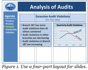
Do you feel that your slide presentations look disorganized and unprofessional? Maybe your basic slide layout needs a facelift! Layout refers to the way you arrange your text and graphic elements on the slide. Obviously, you want your slides to look clean and well organized, not chaotic and cluttered. PowerPoint, Keynote, and other slideshow software provide various templates, but they often result in boring slides with too many bullet lists. Instead of using these templates, create your own layout. Here are four suggestions to help. 1. Use a Grid Divide your slide into a four-part grid, as shown in Figure 1:
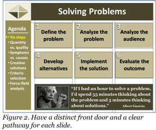
Organize the body area into a grid, consisting of one or more vertical columns, with appropriate space above, below, and between columns. Figure 1 shows an example of a four-column grid for the body. With this layout, you can have one very wide column, two equal wider columns, four equal narrow columns, or an unequal three-and-one column arrangement. In Figure 1, the first body text spans all four columns; the remaining bullet list and graphic span two columns each. Regardless of the layout, always appropriately align the text and graphic items. Items can be top, bottom, left, right, or center aligned, as appropriate. For example, the side-by-side boxes in Figure 1 are aligned both top and bottom. They are also right and left aligned with the heading “Excessive Audit Violations.” The important point is to develop a grid that works for you and to use it to achieve visual consistency among all of your slides. A grid gives your slide presentation a well-organized, professional appearance. (To make sure the gridlines don’t show on your final slides, use the gridlines feature of your software, rather than drawing your own.) 2. Use a Running Agenda Display a running agenda (outline) of your presentation content (in Figure 1, see the agenda in the dark blue bar on the left side of the slide). A running agenda produces two benefits. First, it shows your overall information architecture, which your audience can use for mentally organizing what you present to them. Second, a running agenda helps the audience remember the big picture, even when you take a deep dive into the details of your presentation. Without a running agenda, listeners can easily get mentally lost, not knowing how the details tie in with the overall information. The running agenda can be on the left side of your slides, as shown in Figure 1, or across the bottom. Always include a pointer or other visual indicator to show where you are in the presentation. For instance, while talking about “Analysis” information in your presentation, change the color of “Analysis” in the agenda, and/or place a small arrow beside it (see Figure 1). When you move from the “Analysis” section to the “Conclusion” section, change the color of “Analysis” back to the normal color and highlight “Conclusion.” Also move the arrow to the appropriate point beside “Conclusion.” A running agenda is especially useful for informative presentations, such as training or briefing presentations. Be sure to repeat the agenda on every slide, or at least on the first slide of each major segment of your presentation, to remind the audience of the big picture. 3. Have a Distinct Front Door Make sure each slide has an obvious front door—a clear point of entry. The front door should be a visually dominant object or text item that you want your audience to notice first. Because people’s eyes naturally go to the top of a slide, generally place your front-door item in that area. For many slides, your front-door item will be the slide’s title, displayed in a large font to make it stand out. For example, you could make a slide title highly visible by using a 44-point, bolded Arial font, while using a smaller, less visually emphasized font for the rest of the text on the slide. The large title would attract the audience’s attention and serve as the entry point (front door) of the slide. For other slides, the front door could be a large photograph or another eye-catching visual. 4. Have a Clear Pathway After entering the front door of a slide, your audience should be able to see an obvious pathway through the body of the slide, generally following a natural reading trail from top to bottom and left to right (except for languages written from right to left). For example, with a two-column layout, this path might run from top to bottom in the left column and then top to bottom in the right column. Regardless of a slide’s specific pattern, the path should be visually obvious. As needed, include numbers, arrows, or other visual markers to make pathway clear. For instance, if six text boxes are arranged in a two-by-three pattern, use arrows or numbers (1, 2, 3, 4, 5, 6) to designate whether to read the boxes in top-to-bottom-left-to-right or left-to-right-top-to-bottom sequence (see Figure 2). As you work with slide layout, feel free to alter the layout as appropriate. For instance, use three columns in your body area grid (see Figure 2), rather than using four as shown in Figure 1. To help decide how to lay out your slide content, ask yourself, “Given the information I want to display, what is the best way to organize it on a slide?” You might also ask your colleagues for their input. Two heads are often better than one.
As you create your next slide presentation, apply the four steps presented above. Initially, your layout might take a bit of time to set up. But as you persist, your slides will become more organized, both logically and visually, thus enhancing both the logos and ethos of your presentation. Give it a try and let us know how it works for you. -Bill Baker
3 Comments
12/15/2016 03:59:47 pm
Some problems don't have solutions: Like - a stalemate in a chess game is not a solution. AND - If there are too many unknowns, there is no solution.
Reply
12/19/2016 05:57:30 pm
Developing alternatives should include abandoning an insoluble problem, so - the terminology, 'Define the problem' might be replaced by something less specific about details and more specific about direction, such as: 'Define the goal'.
Reply
Bill
12/19/2016 10:07:42 pm
Thanks for your good observations. If this blog had been about problem solving, rather than about slide layout, we could have gone into more discussion about the points you have raised.
Reply
Your comment will be posted after it is approved.
Leave a Reply. |
AuthorsWe're Bill, Matt, and Vince, and we hope these posts will help you more effectively teach business and professional communication. If you like what you read, please consider teaching from our business and professional communication textbook. Archives
January 2022
Categories
All
|


 RSS Feed