 You need to communicate with another person, but you’re a bit fuzzy about how you’re going to approach the situation and what you’re going to say. If only there were a clear pathway to help you prepare!
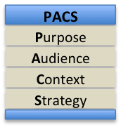
The following four-step PACS plan (Purpose, Audience, Context, Strategy) might be just the thing you need. Step 1. Purpose First, clearly identify your purpose. Usually, your purpose will be one or more of the following—to inform, to persuade, or to enhance a relationship. Within each of these generic purposes, state precisely what you want the outcome to be. Step 2. Audience Analysis With your purpose in mind, analyze your audience, remembering that your message might have both primary and secondary audiences. Consider the audiences’ demographic (e.g., profession, age, education, gender), psychographic (e.g., interests, beliefs, attitudes, preferences), and knowledge (e.g., general and technical) factors. Think about their wants and needs. Consider that there may be both driving and restraining forces battling for and against you in their minds. For instance, they might want to learn more about your product, but their busy schedule and their current financial constraints might be exerting a powerful negative force that is working against you. Step 3. Context Analysis In addition to analyzing the audience, analyze the context in which your communication will occur. First understand the unique attributes of the industry in which the audience works—whether banking, electronics, healthcare, or other. Learn also about major competitors in the industry. Second, consider relevant factors in the audience’s organization—its purpose, products, procedures, and problems. Finally, consider the unique situational factors—your previous interactions with the audience, the level of trust that exists between you and the audience, time pressures, technical challenges, and so forth. Step 4. Strategy Finally, based on the results of the first three PAC steps, develop a communication strategy. Creatively plan how you can navigate through the context and audience challenges to achieve your overall purpose. First, develop a channel strategy—considering the relative pros and cons of available channels, determine whether to make a phone call, write an email, send a text, or talk over lunch. Second, determine your psychological strategy—your overall approach (direct or indirect), your appeal (logical and/or emotional), and your tactic (positive and/or negative). For example, assume that your purpose is to get Sydney, a sales manager you met at a recent convention, to allow you to explain and demonstrate your sales-enhancement software—ultimately to convince her to buy your product. From your audience and context analysis, you know that her organization is lagging in the industry and needs to increase sales. However, you also realize that she doesn’t know much about your product or about you as a person. Therefore, you decide that your main strategy will be to capitalize on the pressure Sydney is feeling to increase sales. Using a relatively direct approach, you will demonstrate your product and provide client testimonials and research data that validate the effectiveness of your product. Using both positive and negative tactics, you will emphasize the benefits of adopting your product, as well as the hazards of delayed action. As needed, you will also present a side-by-side comparison of your product and that of your main competitor. But first, you’ll strengthen your relationship by making a phone call to invite Sydney to lunch where you can learn more about her needs. During lunch, you will propose the idea of an onsite product demonstration. You’re now ready to pick up your phone and make the call, knowing clearly your purpose, and understanding as much as possible your audience and the context of the interaction. PACS planning has helped you feel confident and prepared. The next time you need to communicate, I invite you to plan with PACS. Remember the old adage—if you fail to plan, you plan to fail! -Bill Baker
2 Comments
Today’s world is much more visually oriented than it was in previous generations. Granted, we still consume a lot of text, but more and more messages include a mixture of visuals and text, such as ads, blogs, procedures, business cards, websites, or slides. What guidelines should you follow to ensure good layout and design in messages like these? To answer this question, let’s assume that we want to create an ad that contains the following graphic and text:  Five time-tested principles will help you in this process—contrast, alignment, repetition, balance, and spacing. You can remember these principles with the acronym CARBS, but I’ll apply them in the following sequence: balance, spacing, repetition, contrast, and alignment. Balance Text and visuals on a page should be visually balanced, whether symmetrically or asymmetrically. Symmetrical balance produces a page that looks evenly balanced, with the left and right sides being mirror images of each other. With asymmetrical balance, the left and right sides are not visually the same. Nevertheless, in some cases there may still be balance, such as two small items on the right to counter-balance one large item on the left. To the human eye, symmetrical layout looks more formal, but less interesting; asymmetrical layout looks less formal, but more visually interesting. Because we hope to achieve a visually interesting and less-formal ad for our tire store, we might arrange the elements in an unbalanced, or asymmetrical, layout, as follows.  Spacing To address the spacing principle, first break your graphics and text into chunks. Then, decrease the space between items within chunks (such as spacing within a paragraph), and increase space between chunks (such as between a photograph and a neighboring paragraph). The white space around each chunk serves as a frame or border, dividing one chunk from another. In some cases, you might want to create an actual border around a chunk. For our tire-store ad, we have seven chunks, so we’ll add extra space around each of these chunks. 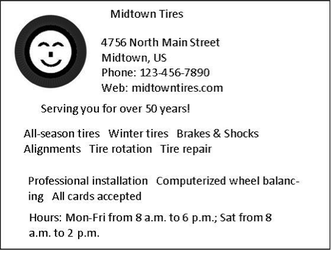 Repetition To achieve good design, establish a visual theme. A theme is established mainly by repeating one or more elements or attributes. For example, for our tire-store ad, we will use the color red as a repeating element of the ad. In addition, we will use the Calibri font for most of the text in the ad. If the ad were larger, we could also use a large image of a tire as the front door of the ad and then repeat smaller images of the tire as bullets for a list of text items.  Contrast Contrast is the key to attracting attention. Contrast can be achieved in countless ways, such as using a different size or color. To use contrast effectively, decide what textual or graphic elements you want to draw attention to. Then make them different from everything around them. For instance, use a different font, or make the font larger, bolder, or more colorful; or use reverse text (white text on black background). You could also include an eye-catching graphic image that stands out from its neighboring text. In our ad, we will use different fonts for the company name and for the company slogan, “Serving you for over 50 years.” We will also use reverse type for one line of text near the bottom of the ad. Further, we’ll use a smiling-tire visual to provide contrast to the text.  Alignment Good alignment requires that every item on a page or slide be lined up with something. Nothing should be just floating in space without a visual anchor. For instance, most text should generally be left aligned—that is, aligned on the left margin, with the right end of the text lines not aligned (called ragged right). For a more formal look, you can use both left and right alignment (fully justified text), but remember that left-aligned paragraphs, with ragged right endings, are generally easier to read than fully justified paragraphs. Graphic elements should also be aligned with other text or graphic elements on the page or screen. For example, align the left edge of a picture with the left edge of text that precedes or follows the picture, or align the middle of a picture with the middle of a column of text that follows it. An alternate form of alignment is curvilinear. For instance, if you are writing a blog about playing the guitar, you could place a picture of a guitar on the left margin and then align the left edge of neighboring text to follow the curved body of the guitar. Left and centered alignments are used in the following tire ad. Notice how good alignment improves the visual impression of the ad. 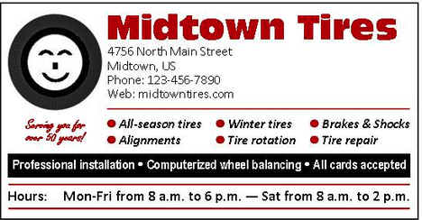 As you apply the various CARBS design principles, keep in mind the overall principle of simplicity. Remember, you are designing, not decorating. Know when enough is enough. Further, make sure all the design treatments harmonize well with each other and help achieve the purpose of the message. Finally, remember that the CARBS principles are just that—principles, not rules. Therefore, if you want to violate a principle to achieve a strategic purpose, go ahead. For example, you might choose to violate the alignment principle to achieve greater contrast. However, be sure you have a good reason for doing so—be sure the violation works and doesn’t look like a mistake. Try applying these CARBS principles in your own documents. You’ll find that they will work for you, just as they have done for thousands of others. 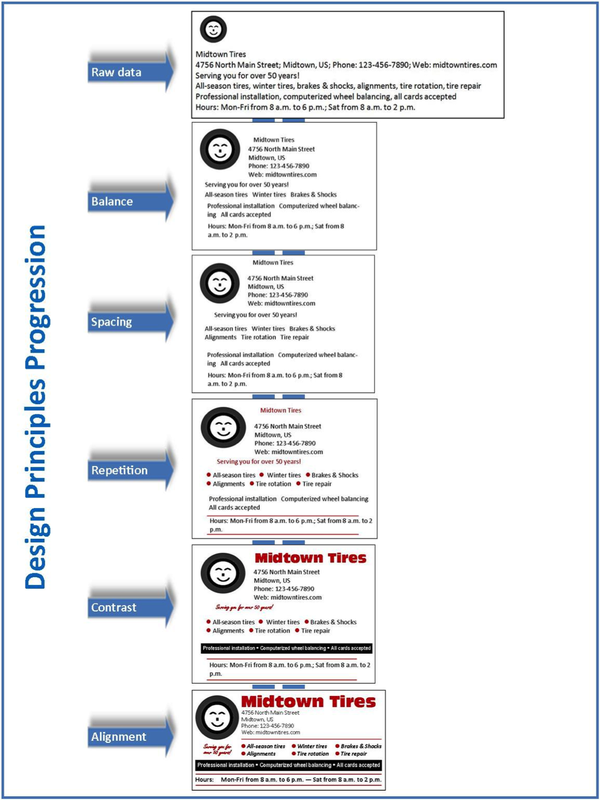 Scenario: A colleague emails and asks, “Would you have time to go through this document and give me some feedback? It’s a really critical document that I’m sending to our new client, and I want to make sure it is perfect.” You have a moment then, so you read through the document, make a comment about a sentence that isn’t totally clear, add a missing comma, and then realize that you don’t have much else to say. Because of the document’s importance, you hope you haven’t missed something really important. You wish you could be more sure of how to give a quality review of written materials.
If you’ve ever found yourself in a similar situation, continue reading. This blog will give you a powerful four-step process called DOCS (Design, Organization, Content, and Sentences). D is for Design. Before you read a document, first check its visual appeal. Does it look easy to read, with appropriate typography, generous white space, and headings to make it skimmable? Or does it look dense, with long paragraphs and long passages of text with limited white space and no headings? Checking the design is like checking the curb appeal of a home you’re thinking of buying. If it doesn’t look good from the road, you’ll just keep on driving. The same thing applies to written documents—if they don’t look easy to read, the audience might also “keep on driving.” (See our HATS post for more detail about document design.) O is for Organization. To check the organization, examine the opening paragraph or two. Is the purpose made clear? Does the beginning of the document contain an agenda that previews the structure or content of the message? After checking the beginning for a clear purpose and agenda, skim the architecture of the entire document. Do the sequence and hierarchy make the content easy for you to process mentally? Does the message follow a clear, well designed blueprint or outline? (See our OABC post for more detail about organizing your messages.) C is for Content. After checking the design and organization, take time to read the full document. Put yourself in the audience’s context, and ask yourself whether the document will achieve its intended purpose. Is the message clear, complete, correct, considerate, and convincing? If not, identify what is missing, such as clearer explanations, more examples, or clearer analysis. Are the individual paragraphs concise and well crafted, with appropriate topic sentences and a coherent flow of information? (See our CLOUD post for more detail about revising paragraphs.) S is for Sentences. Finally, get down to the nitty gritty of editing and proofreading individual sentences. Make sure each sentence has a clear structure, proper punctuation, and correct grammar. Also make any wording changes match the vocabulary of the audience. (See our SPELL post for more detail about revising sentences.) These main DOCS factors are captured in the following checklist: --------------- Design
Next time any of your colleagues ask you to critique their writing, remember DOCS. This four-step approach to document review will help ensure that your feedback is methodical, comprehensive, and effective. Further, try it on your own writing. You’ll find that DOCS will boost your confidence in your ability to write, review, and revise. -Bill Baker One of the most difficult obstacles in all writing is determining how to structure a document when no clear structure exists. For example, if you were going to blog about three new features of a new Apple product, the logical way to structure the post would be to discuss Feature 1, Feature 2, and then Feature 3. In this case, the structure is fairly straightforward. However, what if you want to write a corporate blog about why you enjoy working for your company? You can easily see that the structure of that blog is less obvious than the Apple blog. Enter writer’s block!
When you find yourself facing a not-so-obvious message structure, what should you do? Here’s one incredible outlining technique—bottom-up outlining. This outlining process follows three simple steps: (1) brainstorming, (2) categorizing, and (3) sequencing. If the word outlining causes you to want to stop reading this article, I encourage you to keep reading: bottom-up outlining may not be the same outlining you learned about in middle school. Step 1. Brainstorming When most people think about outlining, they think top down—first select the major categories they want to include in their messages, and then work downward to fill in the details. Bottom-up outlining turns that process on its head. Start with details and then work upward to the broad categories. To create the details, brainstorm. If you’re brainstorming on a computer, open Notepad or Word and begin creating a random list of whatever comes into your mind. Using the example of the benefits of working for your company, for instance, you might come up with the following:
Step 2. Categorizing Once you have captured your random list, you are ready to move on to the second step—categorizing. To categorize, analyze your list and notice any similarities that exist between individual items on your list. Then move the related items into groups, with an appropriate title for each group. These titles will become the major categories for your final document. Continuing with the corporate blog example, here is how I grouped my random list:
Step 3. Sequencing The final step in bottom-up outlining is to arrange the categories in the most appropriate way to meet your message objectives. Depending on your purpose, the audience, the context of your message, and the content itself, you might order those categories in different ways:
Conclusion Why is bottom-up outlining so effective? First, creating a free list works with information as it currently exists in your brain—it doesn’t force you to first create categories. Second, creating a free list is also great for spawning new ideas that you might not have considered otherwise. Third, bottom-up outlining generates order out of chaos—taking unstructured information and methodically finding an appropriate structure for it, resulting in an organized, understandable final message for readers. Forget all the negative experiences you had with top-down outlining back in middle school. Bottom-up outlining is brain friendly, easy, and very effective. Try the three easy steps of brainstorming, categorizing, and sequencing on your next blog or email. You’ll see how well it works. -Matt Baker If you feel that your English classes included so many sentence-writing rules that you couldn’t possibly remember them all, this blog is for you. The following text describes a five-part framework for demystifying the writing and revising of sentences. The framework is built on the acronym SPELL.
S is for Structure When you think of sentence structure, think of three basic elements: subject, verb, and complement.
Consider the following sentence: “Maria wrote an email to Chad.”
To make your sentences structurally sound, as well as clear and effective, here are a few guidelines for subjects, verbs, and complements. To help remember these guidelines, keep in mind the letters S (for subjects), V (for verbs), and C (for complements). First, use Strong, Specific subjects. Generally try to avoid weak subject structures like “There are” and “It is.” No: There are 26 unanswered emails in my mailbox. It is important for you to attend Friday’s meeting. Yes: My mailbox contains 26 unanswered emails. You should attend the important meeting on Friday. Of course, the pronoun it is appropriate when it refers to a specific thing, such as, “I am sending you last week’s report. It contains the sales activities of our entire office.” Second, place verbs in the Vicinity of subjects. Sentences with separated subjects and verbs can be hard to follow. No: This report on the gradual decline of sales in the Northeast is a warning statement of what could happen in other regions. Yes: This report warns us that the decline of sales in the Northeast could also occur in other regions if we are not careful. Third, keep the complement Clear and free of Clutter. No: We provide each of our not-for-profit clients with frequent updates and communication of relevant accounting developments and changes in standards throughout the year. Yes: For each of our not-for-profit clients, we provide frequent updates on all changes in relevant accounting standards. P is for Punctuation The English language contains over a dozen punctuation marks, including commas, semicolons, colons, dashes, hyphens, parentheses, apostrophes, quotation marks, ellipses periods, and others. After checking the structure of a sentence, check the punctuation. Frequent punctuation problems involve commas and hyphens. The two main functions of a comma are to divide and to replace. For example, a comma divides two independent clauses, as follows: No: I will create the sales brochure and Rachel will design the website. Yes: I will create the sales brochure, and Rachel will design the website. For business writing, a comma should also divide the last two items in a series: No: The discount will be in effect for January, February and March. Yes: The discount will be in effect for January, February, and March. Further, commas should be used to divide, or set off, interrupting elements of a sentence: No: He was however not chosen for this year’s award. Yes: He was, however, not chosen for this year’s award. Yes: She was, in my opinion, the best candidate for the job. A comma replaces the word and in the situations involving two parallel adjectives: No: The lengthy [and] detailed report prompted a series of investigations. Yes: The lengthy, detailed report prompted a series of investigations. Hyphens should be used in most cases involving compound adjectives (two or more adjacent adjectives acting jointly as one modifier). No: We are experiencing a one week delay in our shipments. Yes: We are experiencing a one-week delay in our shipments. No: Last week he applied for a small business loan. [This is correct if the loan was small, but not if the loan was for a small business.] Yes: Last week he applied for a small-business loan. Finally, one punctuation mark ought to be used more than it is—the dash. Dashes can often be used in place of commas, colons, and parentheses, as in the following cases: Commas: He implied, although he didn’t actually say it, that Jack would be transferred. Dashes: He implied—although he didn’t actually say it—that Jack would be transferred. Colon: We finally received the needed part: the long-awaited JRX34 switch. Dash: We finally received the needed part—the long-awaited JRX34 switch. Parentheses: This morning I tried to call Sara (the third time in two days) to tell her about Amy. Dashes: This morning I tried to call Sara—the third time in two days—to tell her about Amy. E is for Errors in Grammar Grammatical errors in your writing can severely undermine your credibility; they present an image of ignorance or laziness—that you don’t know or don’t care about certain rules of writing. Watch especially for errors in case (subjective, objective, and possessive), agreement (number, person, and gender), tense (past, present, and future), mood (indicative, imperative, and subjunctive), numbers (what to write as words and what to write as figures), and capitalization. The rules governing grammar errors are too numerous to deal with in this blog, but you can find complete coverage of these rules on this website under the menu link Grammar and Format Guide. This guide focuses on the most frequently used and abused grammar problems in business. Spend two or three evenings reviewing this section to brush up on rules that you once knew but may have forgotten. L is for Language With sentence structure, punctuation, and grammar errors taken care of, you are ready to check the words themselves. First, words should be clear—they should be easily understandable to the audience. For example, technical words are fine to use if the audience is familiar with them. Second, they should be appropriately specific—neither too general nor too precise. For instance, in one context you might use the word employee, in another context you might use the word accountant, and in yet another context you might use the name of an actual employee--Kent Jackson. Third, the words you use should be correct in spelling, usage, and meaning. You should be aware of words that often cause problems, such as spelling receive with the e before the i and using principal and principle, affect and effect, and its and it’s correctly. Fourth, the words you use should be considerate. They should be appropriately formal and have the appropriate tone for the situation. L is for Length Sentences should be concise. Concise writing is not short and choppy with just the minimal content included. Rather, concise writing contains complete content, but reflects carefully crafted sentences, with no unnecessary words. In other words, every word should be necessary and make a useful contribution to the sentence. Long, wordy sentences can be shortened in three simple ways. First, omit useless words. For example, instead of saying, “He made the exact same error last week,” say, “He made the same error last week.” Because exact and same mean the same thing, one of the words is useless. Second, replace passive-voice writing with active-voice writing (say “Ann wrote the report,” rather than “The report was written by Ann”). Third, condense wordy passages of text by asking yourself, “Could I express the same content with fewer words?” To learn about SPELL in more detail, review Appendix A of our book Writing and Speaking for Business on this website. Business and government writers will find Appendix A to be a useful in resolving most basic sentence and grammar questions. This appendix is also useful in preparing to take the GMAT or LSAT exam. For example, one student wrote, “I had taken several GMAT practice tests and had scored around average on the verbal section. However, before I took the real GMAT, I reviewed the grammar section in Writing and Speaking for Business and scored significantly above average. The tips in the book are incredibly useful, and the examples make the rules easy to understand.” Commit these five SPELL terms to memory, and use them to check your own sentences and the sentences of others who ask for your feedback. As you gain experience using SPELL, both your writing and your writing confidence will increase. -Bill Baker |
AuthorsWe're Bill, Matt, and Vince, and we hope these posts will help you more effectively teach business and professional communication. If you like what you read, please consider teaching from our business and professional communication textbook. Archives
January 2022
Categories
All
|
 RSS Feed